Colour has a big impact upon our perception of everything around us, including the buildings we occupy. Architects are often criticised of painting everything white, grey or black – and whilst we are not guilt-free in this respect it is often with the best of intentions. Use of certain colour combinations can easily ground a building in a certain time period, leaving a building to date less than gracefully. You only need a to think of the browns, greens and oranges of a 1970s interior to instantly place it in that particular decade. The choice of a more neutral palette can keep a building looking modern and exciting it can also bring out and accentuate the beauty of spaces through the play of light upon them.
The careful use of colour can make all the difference if used intelligently and thoughtfully. Primary schools, nurseries and other child orientated places are prime examples of where vibrant and bold colours can make the most impact, however in these situations it runs the risk of being over-used or worse still, used unthinkingly resulting in a visually confusing and disorientating space.
The main thing to remember is that bright and colourful rooms can be a great impact at first but can be tiresome over time, so careful choice should be made of complimentary colours.
On some of our more recent church projects our clients appointed the services of a colour consultant. Their skill is in recommending use of colours that worked well with the existing building’s hues and create a calming yet colourful space. Traditional colours for historic and listed buildings are usually a must, to compliment the historic fabric and period references.
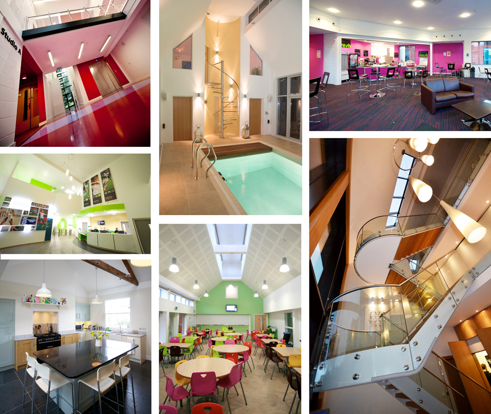
The use of bright coloured, feature walls within a building is one of the favoured methods of highlighting important spaces as well as aiding way finding. Schools and colleges can successfully employ this technique, especially as a means of breaking up long corridors and providing a sense of identity to different classrooms, year groups or teaching departments.
Branding of product or institution is another area where Grainge Architects can add real value to a client with assistance and guidance on colour selection of finishes and materials, to suit the image and identity being presented. The new Health & Fitness Centre at Exeter University Sports Park is a prime example of colour selection of materials and colours to work with an established corporate identity. Grainge Architects worked closely with the University’s in house design department to ensure the building, it’s decor and signage all worked as a cohesive package.
One of our greatest challenges is often assisting domestic clients with their colour selection and it’s coordination with interior design of the home as a whole. Many domestic clients will have strong views on paint colours for walls but might not consider the overall effect of the finished and furnished house. It is in these situations that an architects can bring their experience into play to help guide the client into making the right choices to best work with the overall design.
Whilst much is made of the use of colours for aesthetic and therapeutic reasons, at the more pragmatic end of the spectrum (excuse the pun) is the use of contrasting colours to achieve suitable visual contrast within buildings to aid people with visual disabilities. The visual contrast is based on having a difference in the light reflectance values (LRV) between adjacent surfaces. The Building Regulations and the Equalities Act place statutory responsibilities on designers to ensure that relevant surfaces within a public building have the required contrast to assist the visually impaired with space perception, way finding and even simple things such as being able to identify where a door is within a wall – all things many of us take for granted. So whilst many architects may long to push the minimalist / modernist, simple white spaces and decor – this is the antithesis of inclusive design. Colour is a valuable tool within design, which can lift the spirit and set the mood or even assist the visually impaired – it just needs to be used intelligently.